February 2022 NOTE: This article and wireframes were updated to V2.0. Included:
- Refinements born of split-test data / ongoing iteration
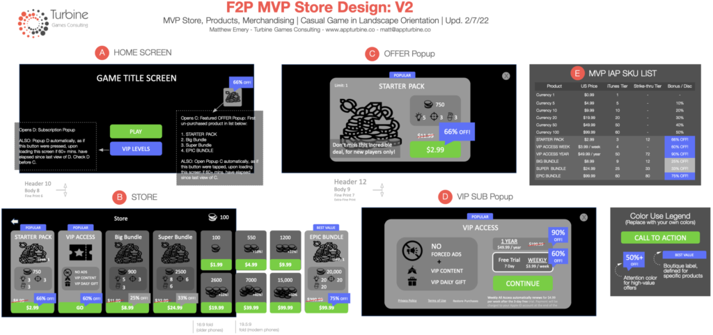
- Added Landscape wireframes
In the first two articles in this series, The IAP Merchandising Playbook Part 1 and Part 2, we focused on the effective visual merchandising of individual offers.
Now, in Part 3, I’ll outline and wireframe what I believe to be the minimum viable store, product and merchandising stack for a new F2P game product.
Why write this?
I often use these articles to efficiently answer common questions we get from our clients. While the previous two articles focused on how to make individual offers more effective, this article’s F2P MVP Store Design addresses a lot of common IAP monetization questions with a single, coherent design solution, plus F.A.Q.
F2P MVP Store Design
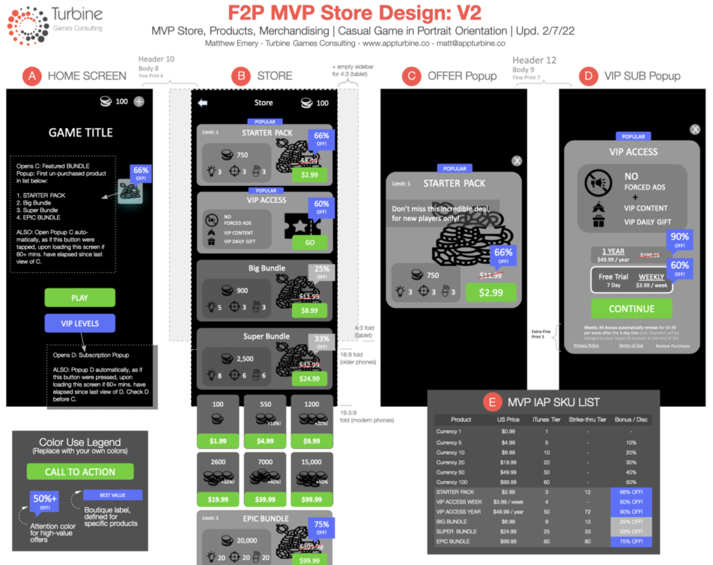
The F2P MVP Store Design V2.0 below includes:
- Store Layout, in portrait (and now landscape!)
- The Starting Offers and Products that new players will see
- Pricing and Discount recommendations
- How to merchandise products outside of the store.
It does not include:
Landscape wireframes (if this would be valuable to you, leave a request in comments!)- Offers introduced after D1 (a topic for a future article!)
- Multiple currency / conversion support (e.g. gems to gold). For casual games, I recommend on-demand conversion via modal popup.
- Tabbed store support for midcore or core games.
Finally, the F2P MVP Store Design embodies specific Design Goals, enumerated below, and the visual guidelines from Part 1 and Part 2 of the playbook. To fully understand the problems being solved by this design, I recommend reviewing these links first!
How do I use the F2P MVP Store Design?
Should my store be portrait or landscape? In nearly all cases, scrolling store UI is most effective in the direction of the longer axis of the screen, so as to maximize the number of onscreen products (facilitating comparison) and minimizing scrolling, for screens of any aspect ratio. In other words, portrait games’ stores should generally scroll vertically, and landscape games’ horizontally.
Casual Games in Portrait Mode: For those of you working on a portrait-mode, casual title with a single-currency economy, the wireframes / design above can be used out of the box. Just forward this article to your Product Manager or UI Designer!
Everything in the wireframes including numerical values can be used directly, except for the coin and consumable payload for each product.
For example, your economy may not (and probably shouldn’t) value 100 coins at $1.00. So, using the base USD value for currency and consumables in your game, just calculate and replace the payload shown for each IAP product based on the IAP prices and bonus values shown in the design.
Midcore / Core Games: For midcore and core games, I’d recommend using this design as your foundation for a simple, tabbed store, with tabs organizing products into clear compartments by use case / player intent.
Any other questions, just ask in the comments!
Design Goals
The F2P MVP Store Design and its components should be quite familiar to F2P game developers.
Where I have deviated slightly from convention, I did so in service of the following design goals, in order of importance:
- Don’t overwhelm the eye: Ruthlessly minimize visual clutter!
- Facilitate confident decision w/ minimal effort:
- Leverage a first-conversion product: Typically, a high-value, low-price starter offer
- Leverage recurring revenue: Weekly subscription with free trial is a must
- Cater to whales in 1st session with a juicy $100 option
If you don’t like or agree with the approach in the wireframes, it’s likely that your goals or priorities differ from these!
Next, I’ll dig a bit deeper into the three major components of the design, to provide a bit of additional color and rationale.
Step 1: Six Base Currency Products
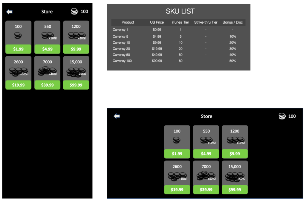
When testing product-market fit, you should be squarely focused on D30 retention improvements, with minimal bandwidth for monetization features.
At this early stage, your fledgling store should look something like the above: Six basic hard currency price points, and nothing else that requires development effort. Porting a more robust store from another game is fine of course, as long as it doesn’t siphon any effort away from your singular focus on D30 retention.
Why six price points? It is the minimum that achieves a reasonable price spread, and the 3×2 matrix keeps the store clean and tight, in service of Design Goals #1 (don’t overwhelm the player) and #2 (see all products with minimal scrolling).
Step 2: Four Starting Bundles
Once your game has reached its D30 retention target, and you are ready to build out your IAP monetization stack, my next recommendation is to fill out the store with four starting bundles, starting at $2.99 and ending at $99.99. The $2.99 and $99.99 are given top (4x) value, to achieve Design Goals #3 (first conversion device) and #5 (juicy whale offer).
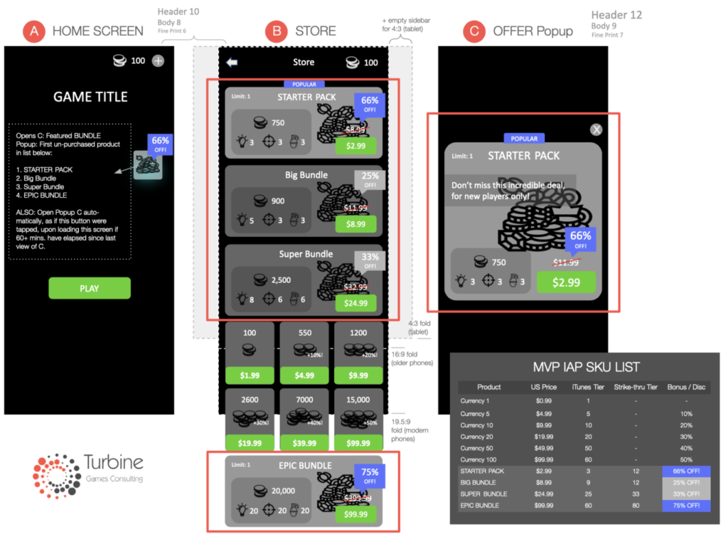
All four offers can be available to new players on install, and the Starter Pack popup can be first displayed during or (more typically) immediately after the FTUE.
Each of the four offers are purchasable only once, but the design foregoes any expiration timers. This omission is a minor design concession to reduce scope, as we don’t want our starting offers expiring (leaving an offer void) until we have a schedule of new offers to backfill (a topic for another article: Store Design V2.0!). Until then, the starting offers meet our design goals while creating the appropriate level of upsell pressure.
All four of these bundles include 1) popup reminder / merchandising as shown above in C. Bundle Popup (simply swap the product data on the popup design), and 2) Title Screen merchandising, as shown in A. Home Screen.
Step 3: Two Subscription Products
If your game uses interstitial and/or banner ad monetization, you’ll need a remove-ads product. My recommended solution? An auto-renewing subscription, which leverages both the conversion benefit of the free trial and the ARPU benefit of auto-renewal. For your MVP I recommend just two choices: 1) weekly and 2) annual, for simplicity (see Design Goals #1 and #2).
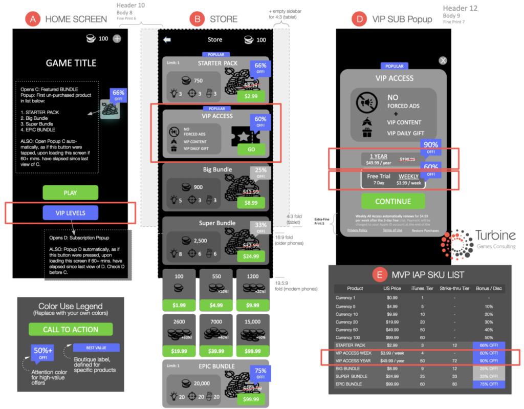
“If our game doesn’t have forced ads, do we still need a subscription?”
First, and particularly for casual games that aren’t ROAS-positive, I would strongly recommend testing the use of forced ads with new users, to see if the ARPU benefit outweighs the retention loss.
Secondly, when it comes to subscriptions, my general recommendation is that ALL games test a subscription product, in order to leverage its powerful one-two punch of free trial + auto-recurring revenue. So, if you can’t offer ‘remove ads’ as the tentpole benefit, you’re not off the hook! Just substitute another benefit that’s appropriate for your game economy.
Key Takeaways
For Casual game developers, these wireframes can serve as a starting point for your store and offer merchandising design.
For everyone else: If not directly useful, the wireframes can serve as a more- robust example of the visual merchandising principles from Part 1 and Part 2 of this series.
That’s it for now! In the next article, The IAP Merchandising Playbook, Part 4 we’ll wireframe Store V3.0, which includes progression offers, timed sales, just-in-time sales, and features specific to midcore games. As always, we’ll keep designs as lean as possible, with the hope of delivering “maximum ARPU with minimum effortTM.”
^ Editor’s note: Not a real trademark… yet 🙂
Need help with your game’s performance? Contact matt@appturbine.co to see if we can help!
——————————————————-
Thanks for reading! If you found this interesting, useful, or even disagreeable, don’t hesitate to message me through LinkedIn or email at matt@appturbine.co
Other mobile game product management articles you might find interesting:
The IAP Merchandising Playbook – series:
Mobile Game Design: Getting More With Less: 6 High-Yield Design Patterns
Mobile Game Monetization: Do you know your game’s spend depth?
How to Fail at Mobile Game Product Management – series:
Mobile Game Analytics – series:
Cheers!
-Matthew

