November 17, 2020
The IAP Merchandising Playbook, Part 2: Visual Hierarchy
In the first article in this series: The IAP Merchandising Playbook, Part 1 we provided a simple checklist for ‘Captivating’ Special Offer Merchandising:
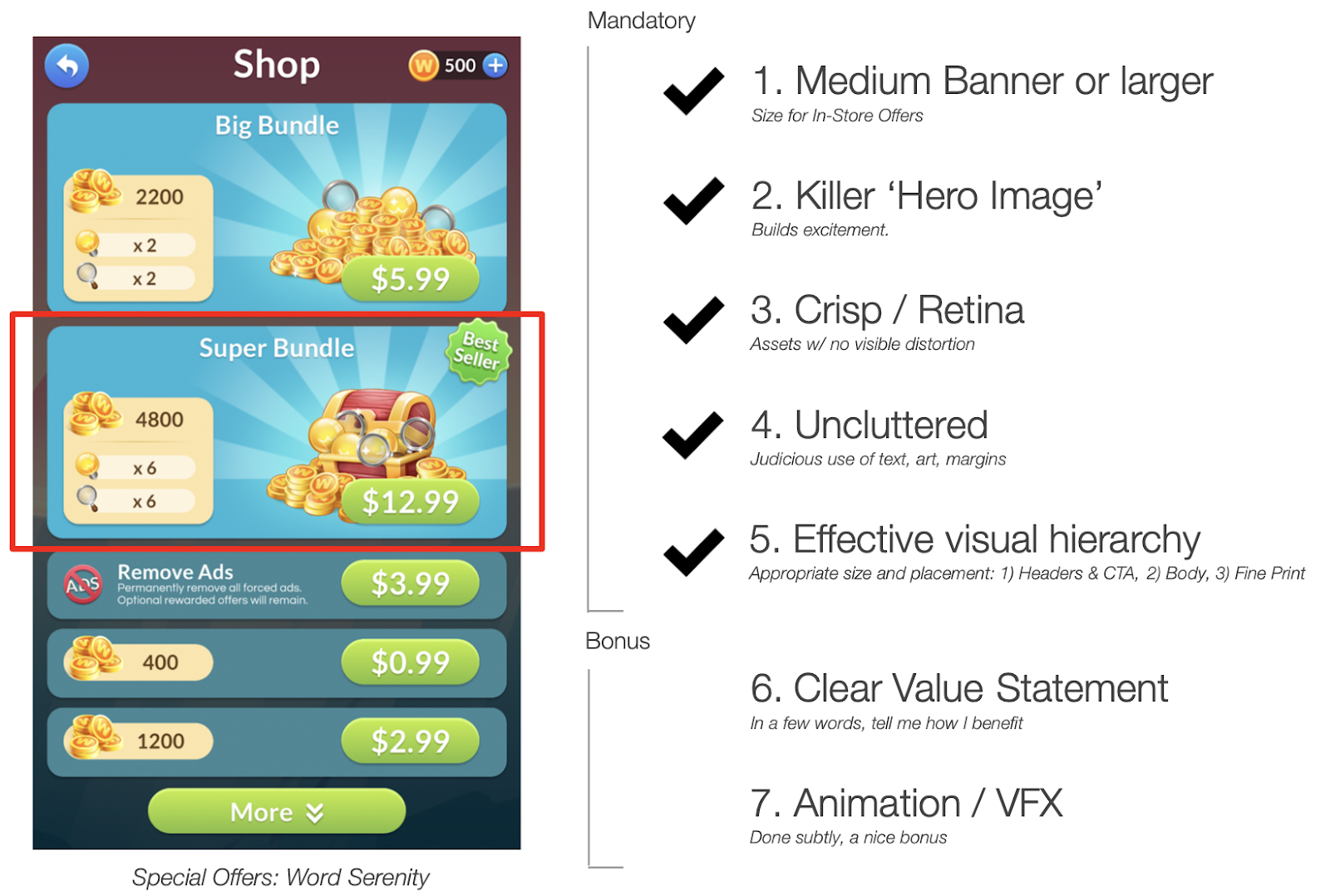
In this article, we’ll take a closer look at one particular item in our checklist: #5 ‘Effective Visual Hierarchy.’
What is Visual Hierarchy?
When viewing a collection of distinct visual elements, our eyes naturally gravitate to large, bold, high-contrast, or animated elements first, and to small, lower-contrast elements last.
By being more deliberate in how we structure information, we can guide the user’s experience and streamline their purchase decision.
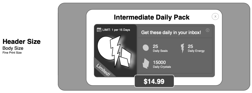
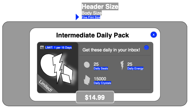
As an exercise, look at the offer below, imagining yourself as a player seeing it for the first time. Where do your eyes go first? In what order do you 1) see items, and 2) actually process the information they convey?
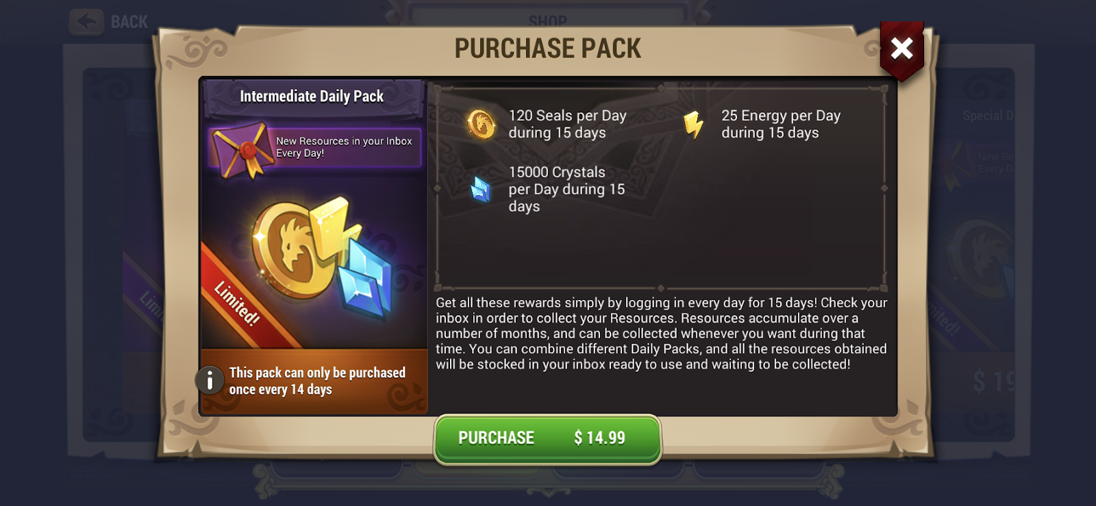
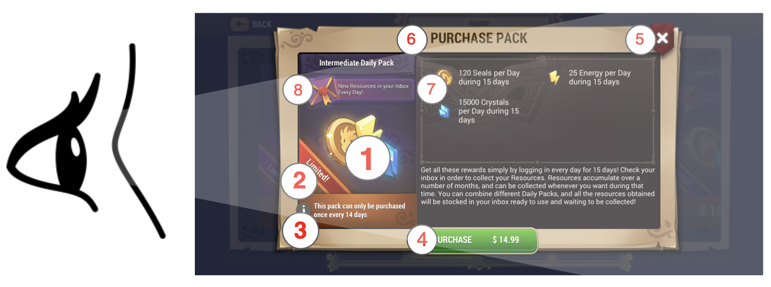
There is no right answer of course, but for me the visual journey goes something like the above.
The large, bright hero image attracts my attention first (a good thing!). From here, my eye is drawn to nearby high-contrast elements: “Limited!” and “This pack can only be purchased once every 14 days!” which, to me, are not highly relevant to my immediate purchase decision. A time-limit would be more meaningful.
Next, my eyes land on the green call-to-action button: “Purchase: $14.99,” briefly before jumping to the very high-contrast ‘tap X to close’ button to the upper right, which seems to dare me to close the popup before considering further information.
If the goal is to help me make a purchase decision quickly with minimal effort, the information here isn’t organized optimally.
Let’s redesign it!
Redesigning for Visual Hierarchy
As a rule of thumb, I recommend arranging visual hierarchy into a maximum of three ‘tiers.’
Above, we have created an information hierarchy with three distinct tiers through deliberate use of contrast and size. Each tier in the hierarchy has a corresponding text size: 1) Header, 2) Body and 3) Fine Print.
Our intent is to help the user consume information in the following order:
- Tier 1: HEADERS: Hero image, product title, purchase button. We want players to see these first.
- Tier 2: BODY: Key product value propositions: “Get these daily in your inbox!,” “Limited!,” resource icons and quantities. We expect that nearly all players will read and process this information before making a purchase decision.
- Tier 3: FINE PRINT: Additional information that is optional and not critical-path in the purchase decision for most users. For this offer, fine print includes text labels for each resource (if icons alone don’t do the trick), the ‘more info’ button and the x / close button. These elements are here if needed, but definitely don’t need to attract attention.
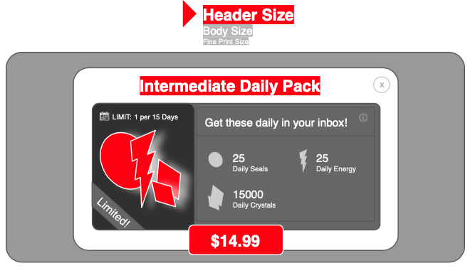
Above: Generally, the items deserving ‘Tier-1’ treatment are hero image, product title and purchase Button.
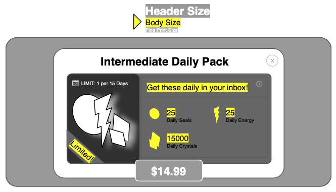
Above: ‘Tier-2’ elements generally include 1-2 Value Statement(s), resource icons and quantities.
Above: ‘Tier-3’ is for non-critical supporting information (i.e. fine print) and the close button. The information is there in case players need it, but most won’t. Regarding the close button, most players reflexively know where to find it, so it needn’t attract attention.
Let’s use this clear definition of ‘Effective Visual Hierarchy’ to evaluate some more offers, both good and bad!
Do this!
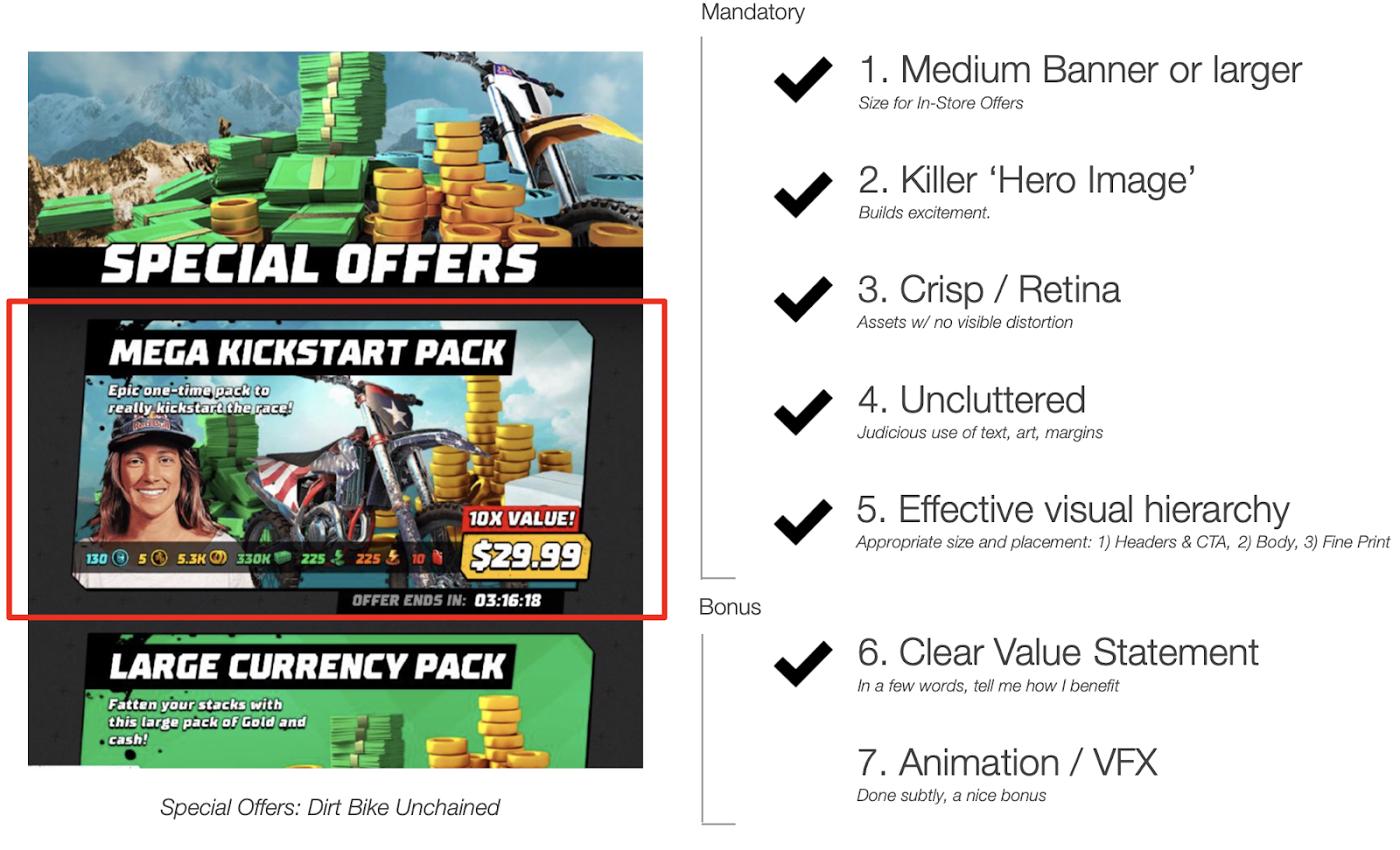
In addition to meeting all of our key criteria, this offer from Dirt Bike Unchained is a particularly good example of a deliberate, three-tiered visual hierarchy. Most importantly, Tier-1 / Header size is reserved for our most important three elements: the (large) hero image, product title and purchase button, and all other elements take a back seat at Tiers 2-3.
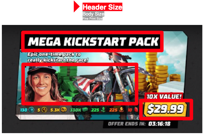
Above: The most prominent elements here are hero image, title and purchase button / price.
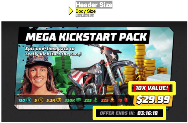
Above: In this offer, Tier-2 sizing is used for the ‘10X Value’ label, and offer expiration timer.
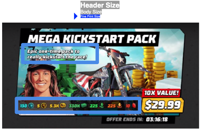
Above: In this offer, Tier-3 sizing is used for the Value Statement, and bundle components. While I would usually put components at Tier-2, it works in this case because this ‘bit of everything’ offer is aimed at new players, who are likely to consider the ‘10X Value!’ statement more immediately relevant than the specific quantities of resources included.
Don’t do this!
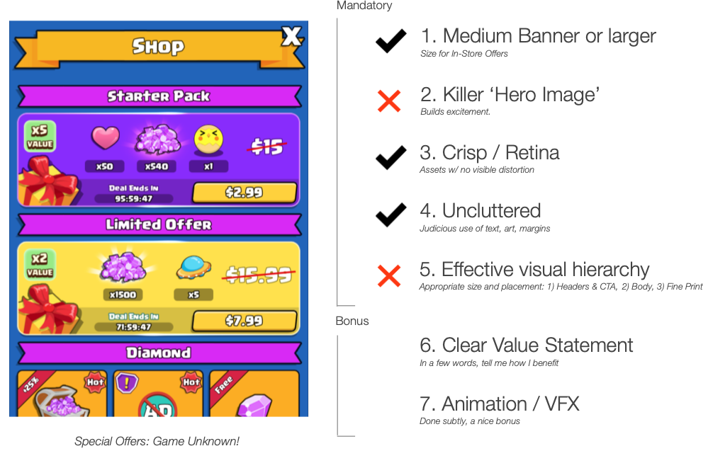
The in-store offers shown above are crisp, colorful and relatively uncluttered. But, because they lack large, compelling hero images, it becomes very difficult to create effective visual hierarchy.
Because the hero images (the gift-wrapped boxes, at left) are small, the bundle components must grow to fill the remaining space. Their size and contrast here arguably elevate them to ‘header’ treatment alongside the title, purchase button and hero image. The large slash-through price ($15.99) is also given header treatment, and the bright, fully-saturated colors used for the large offer containers and title banners give these non-informational elements more visual weight than warranted.
Putting all of this together, we have 8-9 distinct, ‘loud’ visual elements all competing for attention at the same (top) level in the visual hierarchy.
My eye doesn’t know where to go, and I feel a subtle but significant pressure to escape this screen! Now where’s that close button…
Do this!
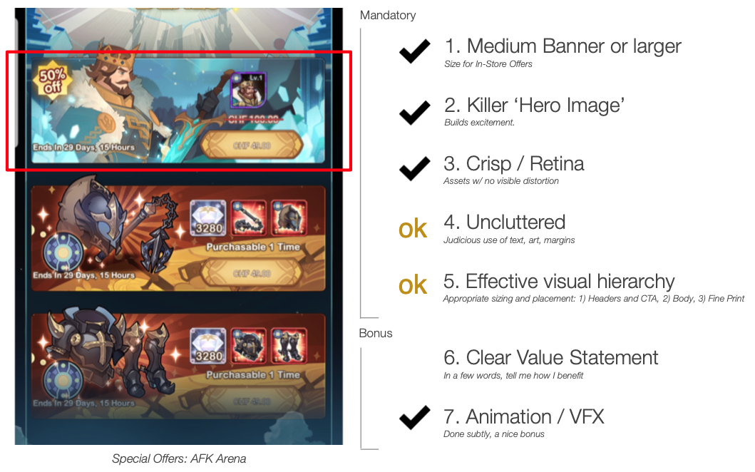
While imperfect, each of the offers in the above example (AFK heroes) gets a pass for our key criteria. The large, aspirational and animated hero images do their job well.
Let’s focus on the visual hierarchy and get specific with potential improvements. I would de-emphasize the background image on the right half of each offer to help the component icons read more clearly.
If I’m being picky, the expiration time needs more margin on the left, and font sizes could change to emphasize price, discount % and quantity, and to de-emphasize expiration time and purchase limit.
Don’t do this!
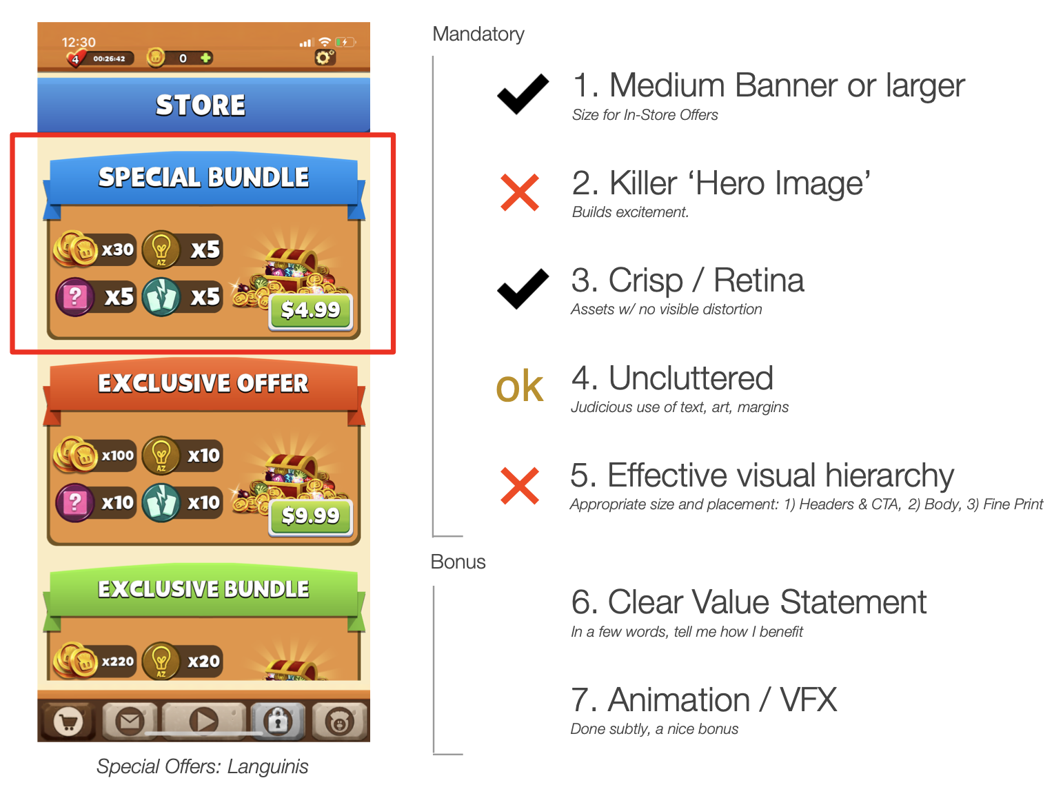
The in-store offers from Langunis come close, but fall short for two reasons: 1) the hero images are too small, AND identical for all offers (tsk. tsk.), and 2) visual hierarchy:
The offer contents at left are given too much visual prominence, and so they overpower the hero image or purchase button. Again, with all elements shouting for attention at similar volume, my eye doesn’t know where to go first, and I’m tempted to close the store to avoid investing more effort.
The examples thus far have all been offers in the scrollable store list. Let’s look at some modal popup offers!
Special Offers: Modal Popups
Review: a modal popup is a popup window that appears on top of an existing interface while keeping the background interface visible but non-functional.
Once again, I’ll pick on Just Kill Me 3.
Don’t do this!
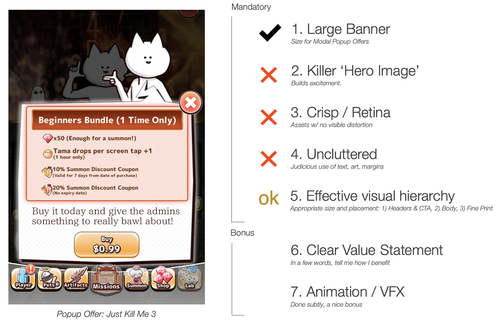
Above, the modal popup offer from Just Kill Me 3 suffers from the same issues as their in-store offers. One improvement here is the attempted inclusion of a hero image (the cat at top-right), but this asset is borrowed from gameplay, and not particularly exciting or aspirational.
Visual hierarchy: despite the lack of margins, the visual hierarchy is reasonably well organized, with the title banner and purchase button benefiting from ‘header’ treatment.
However, the close button is much larger and more prominent than necessary, an issue that I see frequently with popup offers. Treat the close button as Tier 3: fine print!
Do this!

The above example (Empires & Puzzles), satisfies all key criteria in our checklist.
Visual Hierarchy: note the dramatic difference between header and fine print sizes, and the use of header treatment for title and purchase button. The ‘body’ font size is used for the most important value statement: “410% Value!” The animated hero image (top) and animated glows (below) are a nice finishing touch. Note that players can tap each pack component for more information.
Don’t do this!
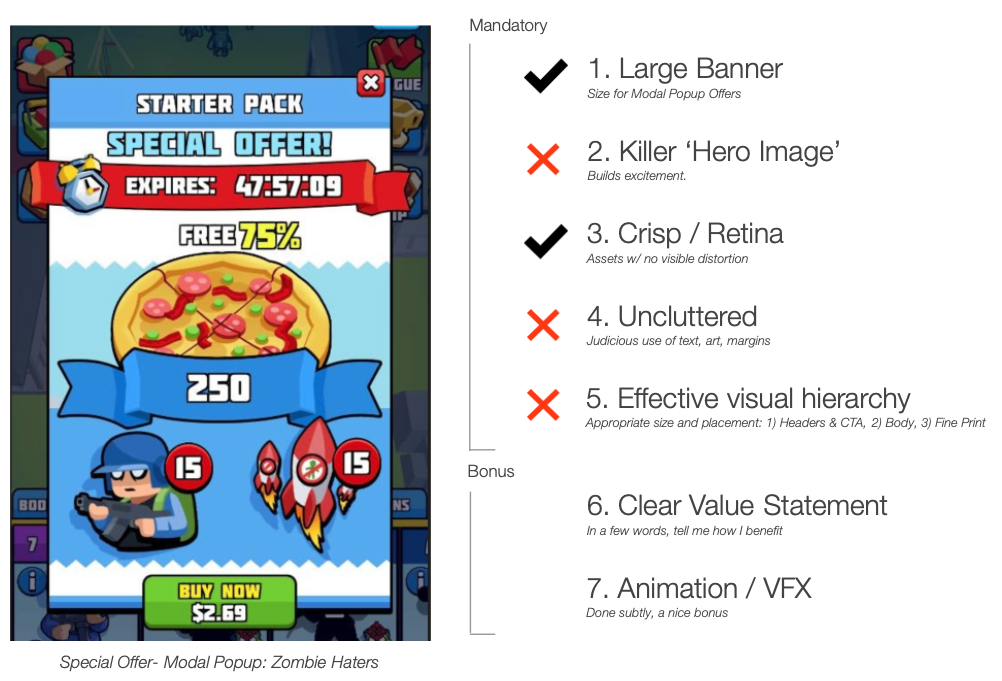
The popup offer above fails on most of our criteria. The use of scaled-up versions of existing game UI icons in place of unique hero image assets is a missed opportunity to convey value.
Visual hierarchy: the myriad of high-contrast, similarly sized text elements (without adequate space between them) creates a feeling of visual overwhelm. All text elements in the top half of the offer seem to be fighting for my attention, shouting with similar intensity in the same header size.
As a player, my eye doesn’t know where to go, so I’m likely to close the popup immediately. It will take a bit of effort (read: too much) to get my bearings and understand what’s important. Is the blue ribbon with the number ‘250’ really the most important piece of information, as suggested by its size and contrast? Is the expiration timer more important than the purchase button?
Do this!
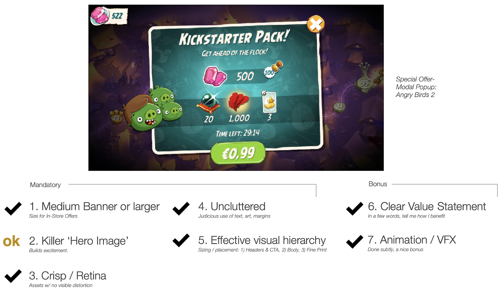
Angry Birds 2’s Kickstarter Pack uses a small hero image that is not unique to this offer (we’ll discuss efficiency and scalability later in this article series). Because their hero image is small, the offer components must compensate, and so are larger than I would normally advise. That one gripe aside, their use of high-quality assets, effective visual hierarchy, slick animations and clear value statement are excellent design choices.
Visual Hierarchy: note the deliberate use of three distinct font sizes: header-sized fonts for title and purchase button, body-sized font for resource quantities, and fine-print size for the value statement and expiration timer.
Don’t do this!
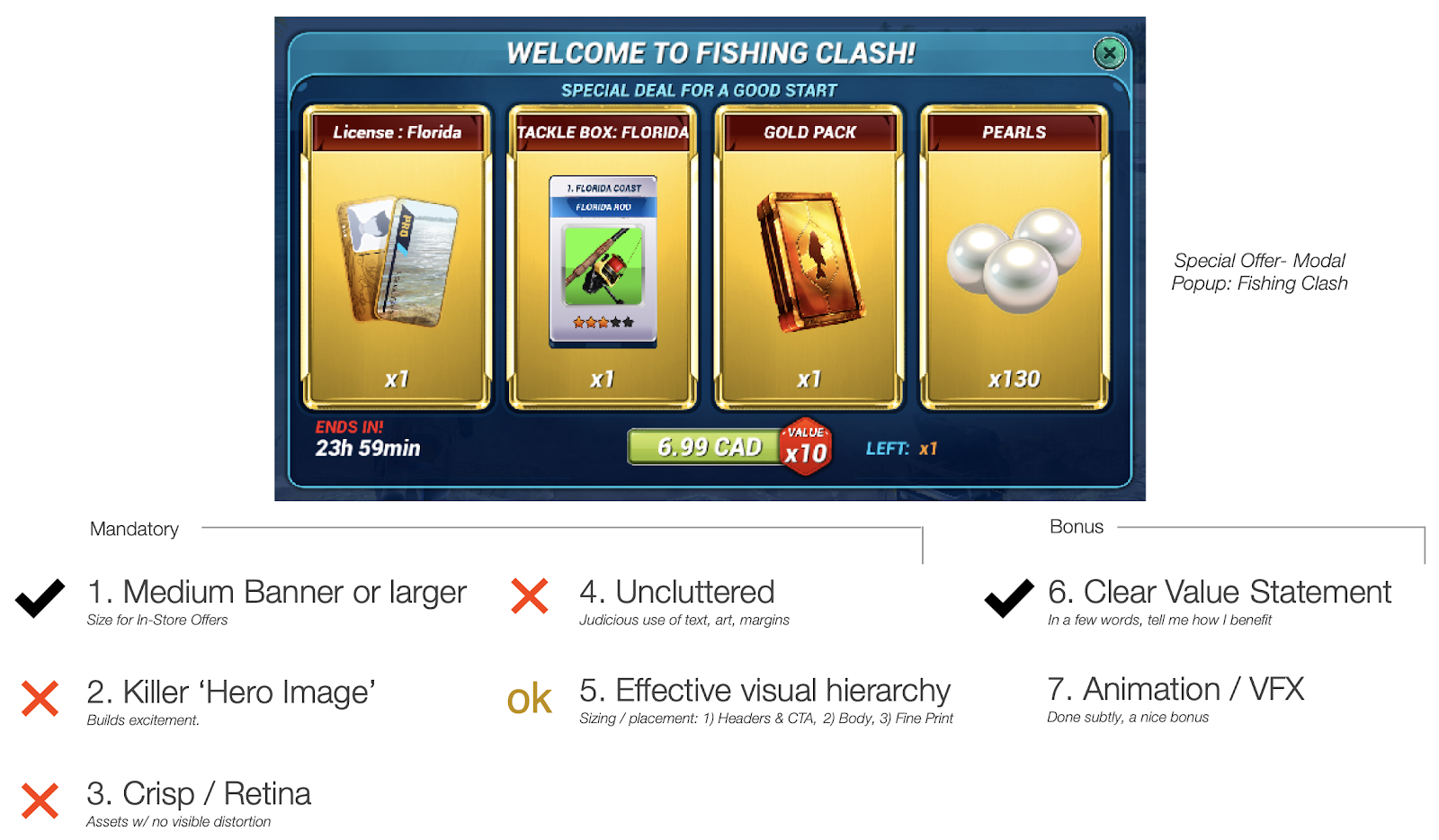
Above, the welcome offer from Fishing Clash has no hero image, and the four large icons representing the four resource types show visual degradation at this size. Inadequate margins between the header, value statement, and the top of the four gold frames create an unnecessary feeling of clutter.
Visual hierarchy: the visual hierarchy focuses the eye on four, monolithic saturated gold rectangles, which somewhat overshadow their contents and leave little space for anything else in the offer. Header font size is given to the product title and purchase button (good), but also to the component quantities (not good). The medium body text size is used for virtually everything else, including value statement, component titles, expiration time, value multiplier and purchase limit.
This offer exhibits another issue I see frequently: overuse of hard-edged nested boxes. This tends to happen when large hero images are absent, and the designer (or engineer in some cases) responds by filling the abundant space with a telescoping series of rectangles. Notice the very heavy borders around the purchase button and each of the four gold rectangles, and the many hard, high-contrast lines that separate the pack title, value statement, and component titles. The heaviness of these high-contrast lines draws undue attention, adding to the visual clutter, and making the offer feel rigid and stiff, like a spreadsheet.
Do this!
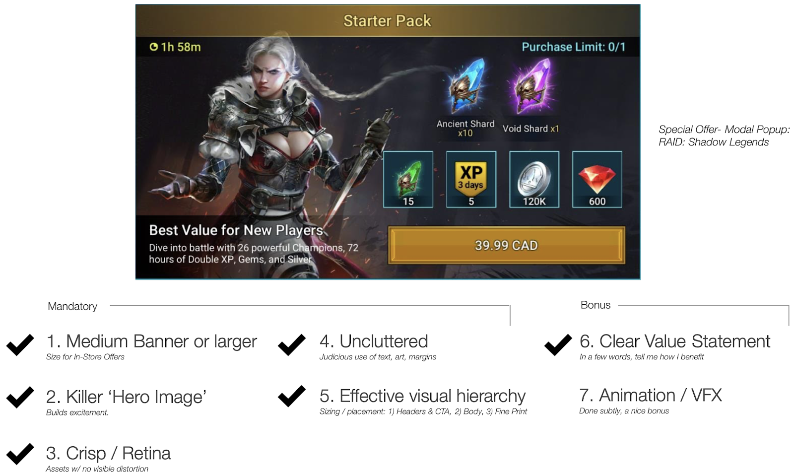
Though they stop short of using animation or vfx, RAID: Shadow Legends does a superb job of achieving consistently high quality across a seemingly endless variety of offers.
An important takeaway here: to be effective, a hero image doesn’t necessarily need to show or even directly relate to the offer contents themselves. Great if it can, but, if not, then any thematically relevant, exciting and unique art asset can do the job.
Visual hierarchy: my eyes go first to the huge hero image and high-contrast, bright, double-walled purchase button. Note the use of body size font for the product price, while giving the button art itself the header treatment.
The offer makes deliberate use of three very distinct font sizes. In this case, header text size is used for the product title (top) and value statement (bottom left), and the fine print size is appropriately small, as it should be! The value statement is perfect for a starter pack.
Finally, notice how the product components are split into two tiers; at top, the larger anchors (blue and purple shards), and at bottom, the four smaller kickers. Given their contrast and size, the anchor shards are arguably given header treatment, which leads to my only gripe with this offer:
There are arguably four different tiers here, which makes the visual journey a bit muddier than I’d like.
I’m being picky, but here is how I would change it.
Before:
After:
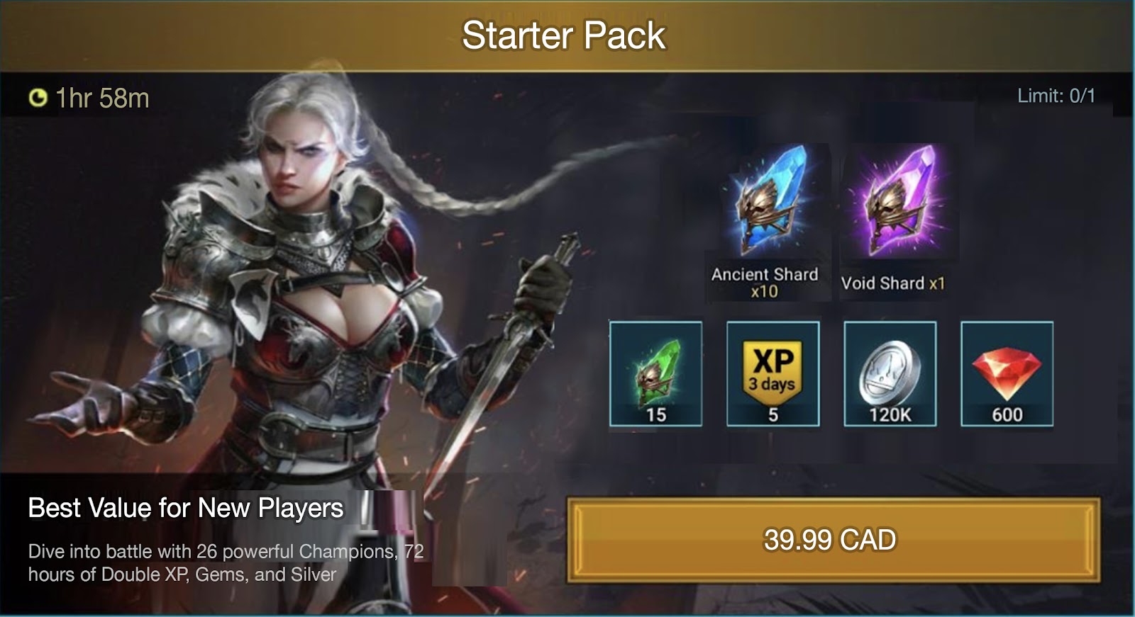
Above: We have clarified the visual hierarchy by 1) Enlarging the title and changing to white font, 2) demoting the value statement, ‘Best Value for New Players’ to ‘body’ text size, 3) making pack components smaller, so as to not overpower the hero image, title and purchase button, and 4) demoting “Limit: 0/1” to fine print text size.
—
Key takeaways
When it comes to Visual Hierarchy, using our three-tier system can prevent the most frequent and egregious mistakes I see in offer layout. Using a large hero image, product title and purchase button as the basis for your visual layout solves much of the problem by forcing you to use smaller icons and fonts for everything else.
With this three-tier system, and the checklist from Part 1: Special Offers that Sizzle, you now have two clear, simple, and easy-to-use tools to guide your game’s IAP merchandising!
In Part 3 of The IAP Merchandising Playbook Part 3: MVP Store Design, we’ll dive into product discounts and offer segmentation.
——————————————————-
If you enjoyed this article, you might also like:
How to Fail in F2P Mobile Games, Part 1: Start without a Business Case
How to Fail in F2P Mobile Games, Part 2: Undisciplined Innovation
How to Fail in F2P Mobile Games, Part 3: Nebulous Product Goals
Need help with your game? Contact me!
Turbine helps mobile game & app publishers drive UA and product KPIs.
Book Intro Call